What We Did
Branding, Communications, Environmental Design, Marketing & Web
The Client
CRNA is a non-profit organization, funded through fees collected from regulated members practice permits. It is arms length from the government and not encumbered financially by government rules, though accountable to its mandate under the Health Professions Act to serve and protect the public interest. The college sets qualifications, issues practice permits, establishes ethical and performance standards, and supports accountability of members through disciplinary efforts.

The Project
When it comes to ensuring all Alberta registered nurses and nurse practitioners provide competent and ethical nursing care, CRNA is at the core. The college previously existed in partnership with the registered nurses’ association, but the college has recently separated from the association and can now focus on their regulatory duties in service to the public. They came to Habit to help launch them into their exciting new future.
CRNA had recently separated from the association, and some audience members were not aware of this. In fact, CRNA has a renewed focus on regulatory duties and ensures the college can offer more innovative, productive leadership.
![]()
Goal
Carve out a new identity for the college, allowing for visibility and trust for all Albertans, as well as increasing the number of new and renewed registrants.
![]()
Branding
CARNA (College and Association of Registered Nurses of Alberta) no longer had the association as part of their organization. Through our research, we concluded that dropping the “association” left us with strong brand recognition to move forward.
We worked on their brand language, giving them the tools to communicate with their internal and external stakeholders.
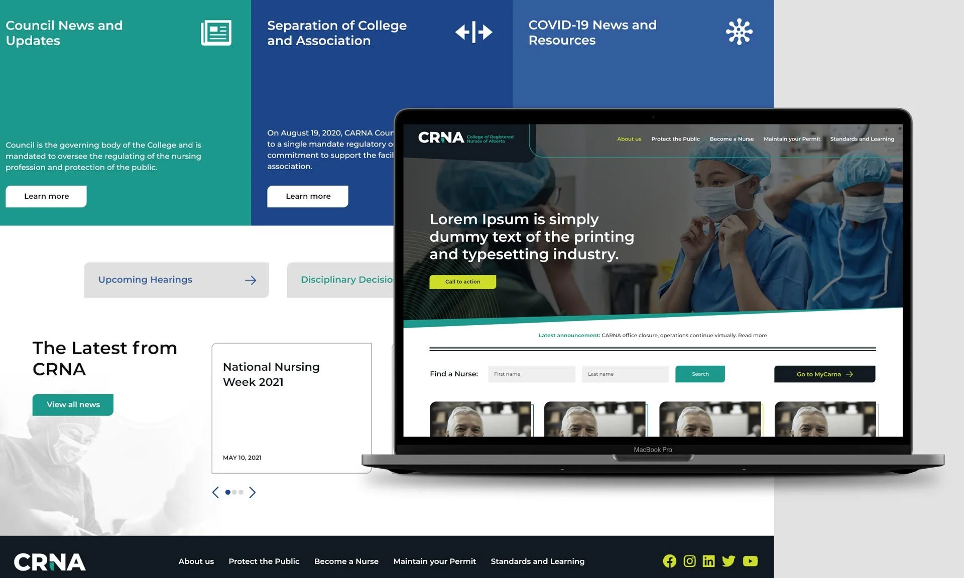
After a name was chosen and brand language underway, we began to focus on a brand that was fresh, bold, gender-neutral and inclusive. Their last logo had no real meaning to them, and they wanted something they could lean into, all while telling a simple story of who they are. We developed several stylescapes using a variety of colour palettes, typography and graphic treatments, all focusing on their audience as the end-user. We landed on a visual system of clean lines and duotone images, allowing for great flexibility and originality in our designs.
A simple logo was created, using the shape of Alberta tucked seamlessly into the leg of the letter N in CRNA. This demonstrates CRNA’s position as a reliable public service, a leg Albertans can stand on, in regards to the regulation of nurses.
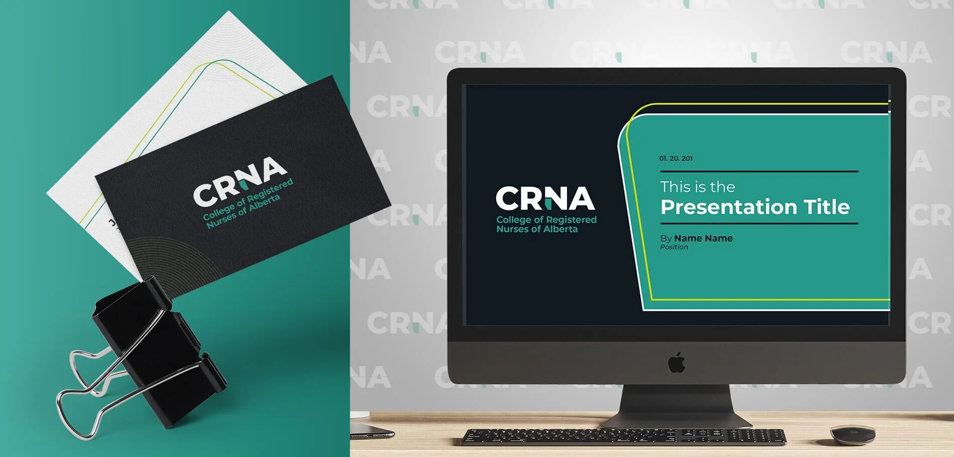
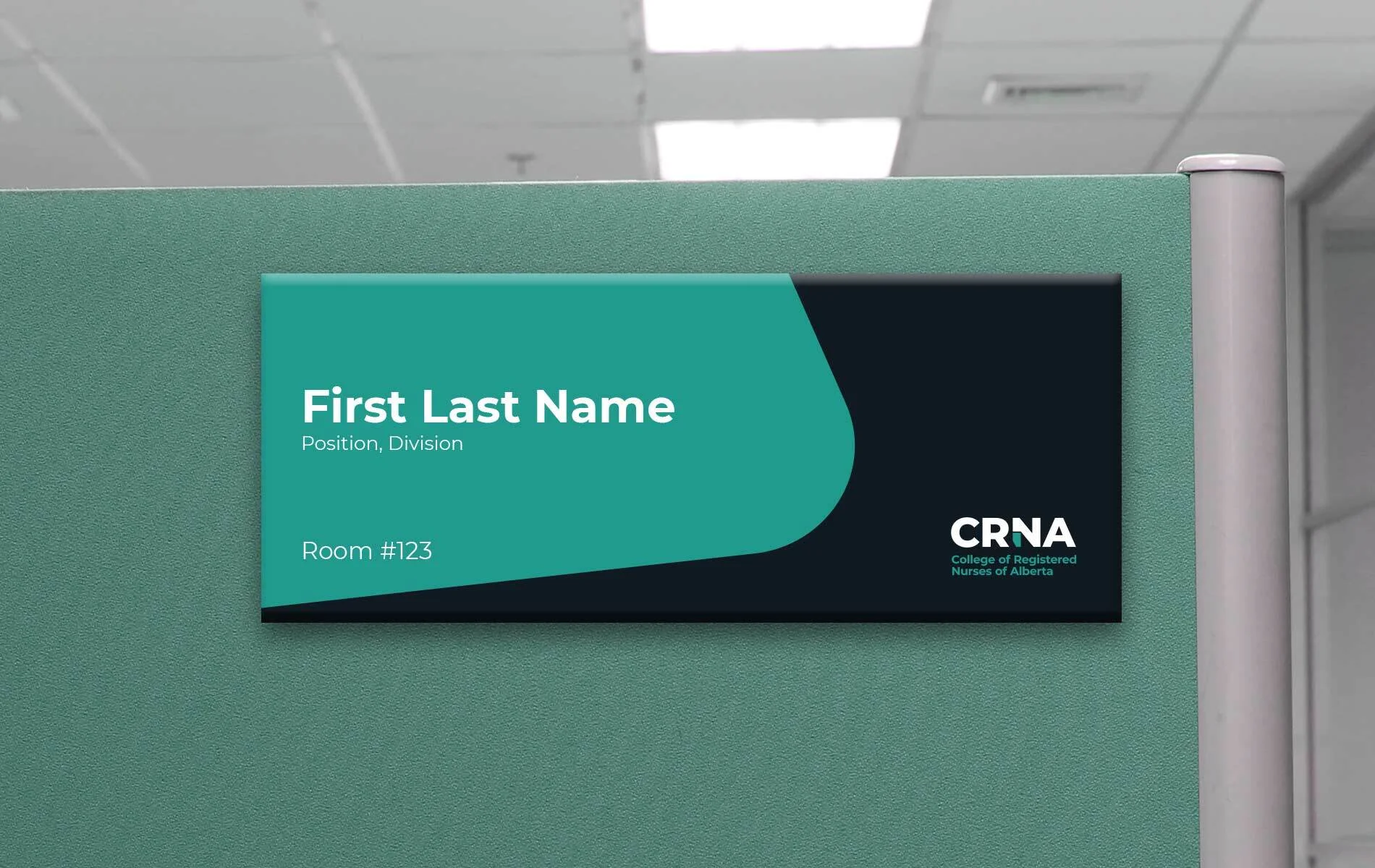
A suite of easy to use collateral was developed, ranging from powerpoint decks, letterheads and office signage. We were sure to create this in a way that they could edit it themselves in the future, and create more designs if necessary – truly an easy-to-use package.
Website Design